 +
Should your new colors and sizes live on one Shopify product page or on separate pages? Shopify product variants fit when color and size change the same base item. A different use, build, or promise usually calls for a separate product. Map each buyer choice to the exact item you stock before you build the selector. This article gives you a size-color map and a way to test whether the page makes sense.
Shopify defines a variant as a version of a base product, with details such as price and inventory that can vary by version. See Shopify's product variant guide for the current platform explanation. The useful catalog question is not “How many SKUs fit on a page?” It is “Will a buyer recognize each option as the same product with one meaningful choice changed?” A variant is a choice inside one offer; it is not a way to hide a different offer.
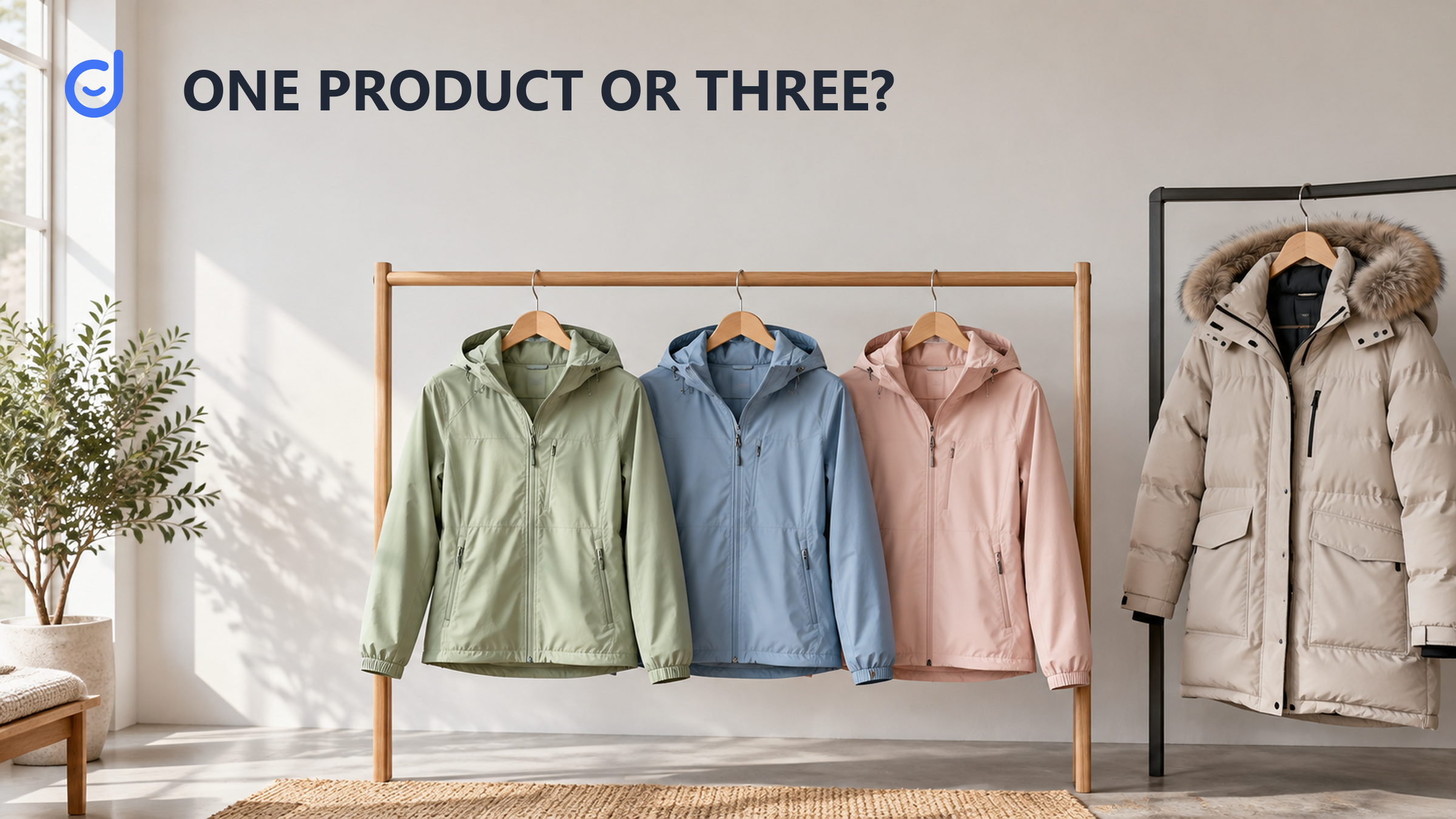
Imagine a jacket laid flat on a table. It has one cut, one material, and one basic use. Beside it are swatches for black, navy, and green. A buyer may want one of those colors and then choose a size. The photo, description, care guidance, and general promise still describe the same jacket. This is a strong starting point for one product with color and size variants. The buyer can compare the choices without reopening the same story on several pages.
Now place a heavily insulated winter coat beside the jacket. It may come from the same brand and even share a color name, but its warmth, build, season, and likely price story are different. A shopper choosing the winter coat is not simply choosing another color of the light jacket. It deserves its own product page and description. The boundary is about the offer the shopper evaluates, not whether the warehouse gives both items similar SKU prefixes.
A catalog can be tidy in a spreadsheet and still be awkward in a storefront. Merchandisers often start with supplier rows because those rows are easy to count. A buyer starts with an intent: “I need the light jacket in navy, medium.” If the page makes that sentence easy to complete, the model is doing its job. If the page asks the buyer to choose between “standard” and “winter” as though those are minor options, it asks too much of a selector and too little of the product description.
Use a simple grid for the hypothetical jacket: three colors across, four sizes down. Each cell stands for one sellable version of the same base product. This example has twelve possible color-size choices; it does not claim a Shopify plan limit or tell you what your store's theme can display. The grid's purpose is to show whether every choice has a real item, clear buyer language, and a stock record. A blank cell should mean either “not offered” or “not available,” not an accidental missing SKU.
| Platform fact | Why it matters for this choice |
|---|---|
| Versions of one base product | Size and color can be choices within the same item. |
| Variant-level price | A larger size can have its own price without needing a new product page. |
| Variant-level stock | Each version needs the inventory record that matches the buyer's choice. |
| Size | Black | Navy | Green |
|---|---|---|---|
| Small | Black / S: check stock | Navy / S: check stock | Green / S: check stock |
| Medium | Black / M: check stock | Navy / M: check stock | Green / M: check stock |
| Large | Black / L: check stock | Navy / L: check stock | Green / L: check stock |
| Extra large | Black / XL: check stock | Navy / XL: check stock | Green / XL: check stock |
Source: Shopify's product variant guide, accessed October 15, 2026. The jacket and its option grid are hypothetical, not a merchant catalog or a test of a specific storefront.
For every cell you plan to sell, write the exact variant name the buyer will see and the stock record your team will manage. If navy medium has a different quantity from navy large, those choices need separate inventory attention. Shopify notes that price and inventory can live at the variant level; this is why the grid is more than a visual exercise. A buyer can choose one version, while the merchant can track that version's stock and price. Do not combine cells merely because they share a photograph.
The map also exposes odd choices. Suppose green is offered only in medium and large. Decide whether the selector should show small as unavailable, omit that combination, or explain that it is not part of the range, based on what your actual storefront supports. The key is to make the buyer's choice truthful. A disabled option that looks like a temporary stockout can mislead someone if that size was never made. Test the page as a buyer would, rather than assuming the admin grid tells the whole story.
A second product page is useful when the differences need a fresh explanation. The winter coat in our example needs its own warmth claim, material details, fit guidance, imagery, and likely search language. Trying to squeeze that into a “style” dropdown on the light jacket page can leave one of the offers poorly described. A shopper who lands on the page from a search or a social post may never realize the coat exists, or may mistake the jacket's copy for the coat's features.
The same test works outside apparel. A bottle in two colors and two capacities might still be one base product if the page can show capacity and stock clearly. A replacement lid is a different item with a different job, even if it matches the bottle. Do not turn every accessory into a variant simply to keep products together. Product relationships can be shown through navigation or related items; they do not have to be encoded as options inside a purchase selector.
Price alone does not decide the boundary. Variants can have different prices, as Shopify's explanation notes. A larger size or material finish might cost more while remaining an understandable version of the same product. But if the higher price reflects an entirely different use, warranty, included component, or performance claim, the buyer may need a separate comparison. Ask whether the product description can stay accurate across every choice without a thicket of exceptions. If it cannot, split the offer.
Nor does a common SKU family settle the issue. SKUs serve internal identification; a product page serves a buyer's decision. Two warehouse rows can be related without being one offer. Conversely, twelve variants can be one coherent offer if each is simply a size-color choice of the jacket. Treat the spreadsheet as a check on inventory precision after you have defined the buyer's choice, not as the source of the storefront hierarchy.
Keep the grid as a seller-owned option map. Add four notes for each planned choice: the label a buyer sees, the image that represents it, the price shown after selection, and the inventory row it uses. Then ask someone unfamiliar with the catalog to complete a sentence such as “I want the navy jacket in medium.” Watch whether they can choose it without guessing. If they select the right label but see a green image or another size's stock message, the map has caught a real page problem.
For the next decision, Make the option promise clear on a second channel
Look at the page on a phone as well as a desktop screen. Can the shopper see the selected color and size near the purchase action? Does the image change in a way that confirms the choice, if your theme supports it? Is an unavailable combination clear before checkout? These are buyer checks, not claims that Shopify configures them automatically. Your theme and apps may render options differently, so test the actual page your customers will use.
Then check the stock side with the person who fulfills orders. Select each available option and confirm that it points to the intended item. One wrong mapping can make the site promise a jacket that is not on the shelf or hide one that is. A clean page is not enough if the selected option cannot be picked correctly. This is where the buyer map and the inventory rows must agree.
Finally, read the copy once with each option selected. A description that says “lightweight” should not silently apply to the insulated coat. A size chart should belong to the cuts it describes. If every option can share the essential product story and the differences are easy to select, variants fit. If the page needs separate sections of caveats to stay truthful, consider separate products. That decision is grounded in the buyer's task and the actual item, not a fixed count of options.
Start the catalog work by naming the offer itself. Shopify product positioning on TikTok can help frame that offer, while buyer-question copy tests for product pages can help you check language after the option structure is settled. Neither determines your store's variant setup. The size-color map and storefront test remain your evidence.
Once Shopify product variants pass the buyer and inventory checks, preserve the same plain choice language wherever the item is listed. A shopper should not see “Navy / Medium” in one place and an unexplained code in another. Channels have different controls, but the offer should stay recognizable. For a related next step, read how to make a TikTok Shop variant promise clear. The catalog decision is already yours: use variants for true versions of one base product, and separate the winter coat or any offer that needs its own story.
Latest Articles

As an essential, data-driven toolkit for TikTok influencers and marketers, KOLSprite provides powerful features for effortless creator discovery, trending content identification, and actionable real-time insights.
It empowers users to make smarter decisions and significantly boosts their TikTok business.

 Refer & Earn