 +
+
If every product in your TikTok feed uses the same hook, background, feature list, and before-and-after shot, the answer is not to make something random. Buyers still need familiar proof. The better move is to separate category table stakes from creative habits that no longer help a choice. This guide shows Shopify and Amazon teams how to build brand differentiation from TikTok category research. You will get a pattern log, a desk-organizer case, a proof-gap map, and three routes for making the next product page and creator brief distinct without becoming confusing.
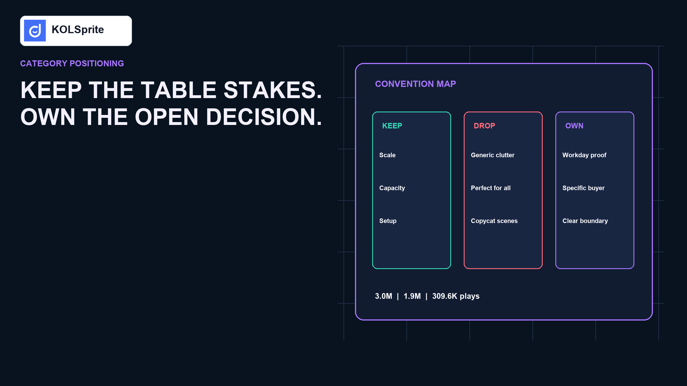
Keep the proof buyers need. Challenge the claim, scene, or check everyone repeats without proof. Add a clear point of view that your product and operations can support. A differentiated idea should be clear enough to understand and clear enough to remember.
Do not be different everywhere. Be unmistakable at the choice that matters.
Categories develop shared patterns because some facts are useful. A desk organizer needs scale, capacity, setup, and a view of the workspace after use. A fabric shaver needs a close view of pilling and the cleaned surface. A vacuum sealer needs the mechanism and the seal result. Removing those scenes for novelty can make the content less clear.
The problem begins when every seller treats the same pattern as a full plan. “Messy desk to clean desk” is a useful proof frame. It does not explain which work, objects, or room constraints the product is built for. If all items promise “aesthetic organization,” price and color become the only visible differences.
TikTok describes Creative Center as a place to find trends, ad examples, patterns, and tools for ideas in its official Creative Center guide. Creative inspiration still needs a seller test. A pattern audit asks three questions: What does the buyer need to see? What does the category repeat by habit? What key choice is still hard after watching the popular content?
Choose one product format and one buyer job. Review a small set of exact product-linked videos, not a broad hashtag feed. Record the opening, scene, proof, claim, objection, creator type, and action. Add the product and source ID so another researcher can reproduce the set.
| Element | Table stake | Crowded habit | Open question |
|---|---|---|---|
| Opening. | Show the space and object scale. | Generic clutter panic. | Which kind of work makes the clutter? |
| Proof. | Show what fits and how it is reached. | Fast before-and-after with no daily use. | Does the system stay usable during work? |
| Claim. | Explain storage and footprint. | “Perfect for any desk.”. | Which desk size and user is it really for? |
| Look. | Use a clear view of the product. | Same pastel setup and slow pan. | Can the brand own another clear setting? |
We searched KOLSprite's US Video Search for desk organizers and retained eight commerce records. The results included a two-tier wooden shelf, a photo-strip holder, a rotating makeup organizer, an artist-supply drawer box, a miniature toolbox organizer, a full vanity, an adjustable bookshelf, and a quilted basket.
The broad term created false similarity. A wooden shelf video showed 3 million visible plays in an eight-second record, while a photo-strip holder showed 1.9 million. An artist-supply drawer box reached 309,600 plays in the accessed record. These items are not direct rivals simply because they live on desks. They organize different objects and identities.
The useful pattern was not “desk organizers are viral.” It was that content often led with a clear mess, a satisfying placement, and the finished look. The open choice was which job deserved ownership: everyday work tools, art supplies, beauty routines, photo memories, or a themed gift.
Research note. KOLSprite US Video Search for “desk organizer,” accessed August 4, 2026. Eight product-linked records were retained to map format and use-case range. Visible plays ranged from about 250,500 to 3 million in the cited set. Public fields can change. The case is not a full group census and does not prove demand, margin, or causal performance.
Map exact products and group patterns before you choose the position to own. Create a KOLSprite account to claim a three-day trial membership.
Register for a three-day KOLSprite trial
Use four gates. Keep a product only if it serves the same buyer job, uses a comparable how it works or format, competes for the same purchase moment, and offers choice-useful content. An expensive artist drawer box may inspire storage proof but does not belong in the price check for a small wooden shelf.
Separate direct rivals, adjacent references, and visual ideas. Direct rivals inform positioning. Adjacent references reveal alternate jobs. Visual ideas inform craft only. Mixing the categorys makes fake whitespace.
For a wooden desktop shelf, the category may prove that it looks neat. It may not show whether a laptop still opens, a notebook can be reached, cables have a route, or the organizer remains useful after a week. That is a proof gap.
The brand could own “organization that survives the workday.” The product page would show setup around a real laptop, notebook, charger, and mug. The creator brief would include a mid-day scene, not only a reveal. The claim would stay bounded to the objects and desk size tested.
This position is different because it solves an ignored choice. It is credible because the camera can prove it. It is useful beyond one TikTok because the same proof can support the Shopify page, ad, email, and support FAQ.
Do not choose all three for the first test. A narrow position is easier to prove and measure. If the product is not meaningfully different, the operating route can be more honest than inventing a feature story.
Use this structure: For [clear buyer in a clear situation], this product helps [choice or outcome] by [credible how it works or operating advantage], unlike [category habit], and we prove it with [visible proof].
Example: “For hybrid workers who switch between typing and handwriting, this two-tier organizer keeps daily tools within reach without taking over the laptop zone. Instead of showing a five-second makeover, we prove the setup during a full work block.”
The sentence is not public copy yet. It is a control. Every page section and creator scene should either support it or be removed.
Start in KOLSprite Product Search to isolate the product format, price range, and linked content. Move to Video Search to record proof patterns, scenes, and creator choices. Use public creator context to see whether the pattern comes from the category, one seller, or one creator style.
KOLSprite helps turn browsing into a repeatable research set. It does not tell you which position your factory, margin, service, or inventory can support. Add product testing, support data, review themes, and brand constraints before the plan is approved.
Share the table stakes, crowded habits, and proof gap. A second operator may catch a false rival or a difference buyers do not value.
 +
+
Review the positioning route on Discord
Give the creator the buyer situation, proof gap, required product facts, one prohibited shortcut, and one flexible area. For the workday position, need a visible laptop zone and a retrieval moment. Prohibit a claim that it fits every desk. Let the creator choose the exact objects and voice.
Ask for one long-enough shot where the viewer can judge the proof. A polished montage can support the story, but it should not replace the proof. Use the same proof definition during sign-off.
The landing page should not return to generic “declutter your life” language after a clear video. The first screen should name the same buyer job. The next section should show the tested desk and objects. A check block can explain who needs this format and who needs another.
Internal proof should travel with the page: tested dimensions, load, setup time, material, care, and known limits. If the video raises a question the page cannot answer, the content is ahead of the product system.
Views can tell you the content was distributed. They do not tell you whether the positioning was understood. Use comment questions, product-detail interactions, check use, add-to-cart, support questions, and return reasons. Ask a small group of buyers what the product is “for” after seeing the page.
If they remember only “cute organizer,” the stand is weak. If they remember “the one that keeps the laptop area clear,” the idea is becoming clear. Verify that the promise also improves qualified behavior and does not raise the wrong expectation.
Spend ten minutes defining the exact buyer job and format. Spend twenty minutes reviewing eight to twelve product-linked videos. Spend ten minutes separating table stakes, crowded habits, and open choices. Spend ten minutes choosing one differentiation route. Spend ten minutes writing the sentence, proof scene, page continuation, and stop rule.
Stop the idea if the product cannot prove it, the difference depends on insulting rivals, or the buyer does not care about the open choice. Revise if the stand is useful but too broad.
Use the false-positive competitor workflow to clean the result set. Use the content proof-test guide to turn the stand into a controlled creative test. If the category relies on creators, the creator audience and category-fit review helps match the proof job with the right public setting.
Do not copy another creator's words, visual identity, sequence, music, or distinctive scene. Do not treat a high-play format as a license to repeat an unsupported claim. Do not make a check you cannot verify. Learn what facts buyers need, then build an original route to those facts.
The strongest differentiating angle may be quieter than the category's loudest hook. Clear limits, useful check, and a scene that mirrors real use can build more trust than exaggerated novelty.
Picture five desk organizers on one shelf. A buyer should be able to say why yours fits a certain desk or work habit. The answer must be short and easy to prove. “It looks better” is weak. “It keeps a laptop charger, notebook, and daily tools in reach on a small desk” gives the team a real scene to show.
Now test that idea in three places. The video should show the desk before use, the setup, and one normal work moment. The product page should show size, fit, and what the shelf can hold. The support page should answer the first limits a buyer may ask about. If the idea falls apart in one of those places, it is not ready.
A good difference also survives a plain image with no sound. The buyer can still see the job, the proof, and the result. That matters on a fast feed and on a store page. It gives the creator room to use a fresh voice without losing the core point.
Run one more check: could a rival copy the words tomorrow and look just as true? If yes, the claim is too broad. Add a real buyer, use case, tested fact, service step, or proof style that your team can own. The goal is not to sound unique. The goal is to make one useful choice clear.
The final test is simple. Show the idea to someone who has not seen the plan. Ask what the product is for and why it fits that job. A clear answer means the team has a useful path. A vague answer means the work needs one more round.
Brand differentiation should make a buyer choice easier, not make the product harder to recognize. Use KOLSprite to map exact products, content patterns, and category habits. Keep the proof buyers need. Then choose one ignored job or proof gap your product can honestly own across the video, page, and buyer experience.
Latest Articles

As an essential, data-driven toolkit for TikTok influencers and marketers, KOLSprite provides powerful features for effortless creator discovery, trending content identification, and actionable real-time insights.
It empowers users to make smarter decisions and significantly boosts their TikTok business.
 Refer & Earn