 +
+
For a small brand planning a photo post, the next swipe depends on a viewer's small decision: is there something here I still want to know? A second product photo is not always an answer. It may show a new angle without giving the person a new reason to care. The sequence needs a question that changes from frame to frame.
Consider an illustrative modular lunchbox. This is an invented product for an original organic photo-story plan, not a customer case or a claim about a real item. The story is about arranging lunch in removable sections. Still images can explain that layout. If the message depends on seeing a lid lock or food stay put during a shake, a short video would carry different evidence.
Picture the first image from above: a sandwich, fruit, and a snack sit beside an empty lunchbox. The open space is the point. It poses a useful question without turning a lunch routine into a crisis. The next image can show the sections placed inside. The viewer now has an answer about layout and a fresh question about what fits.
There is no need for a title slide that says “Meet your new lunch essential.” It consumes the place where a clear image could show the problem. A brand mark can remain small enough that the food and the sections still tell the story. If the only good image in the folder is the closed box, the team does not yet have the visual evidence for this particular sequence.
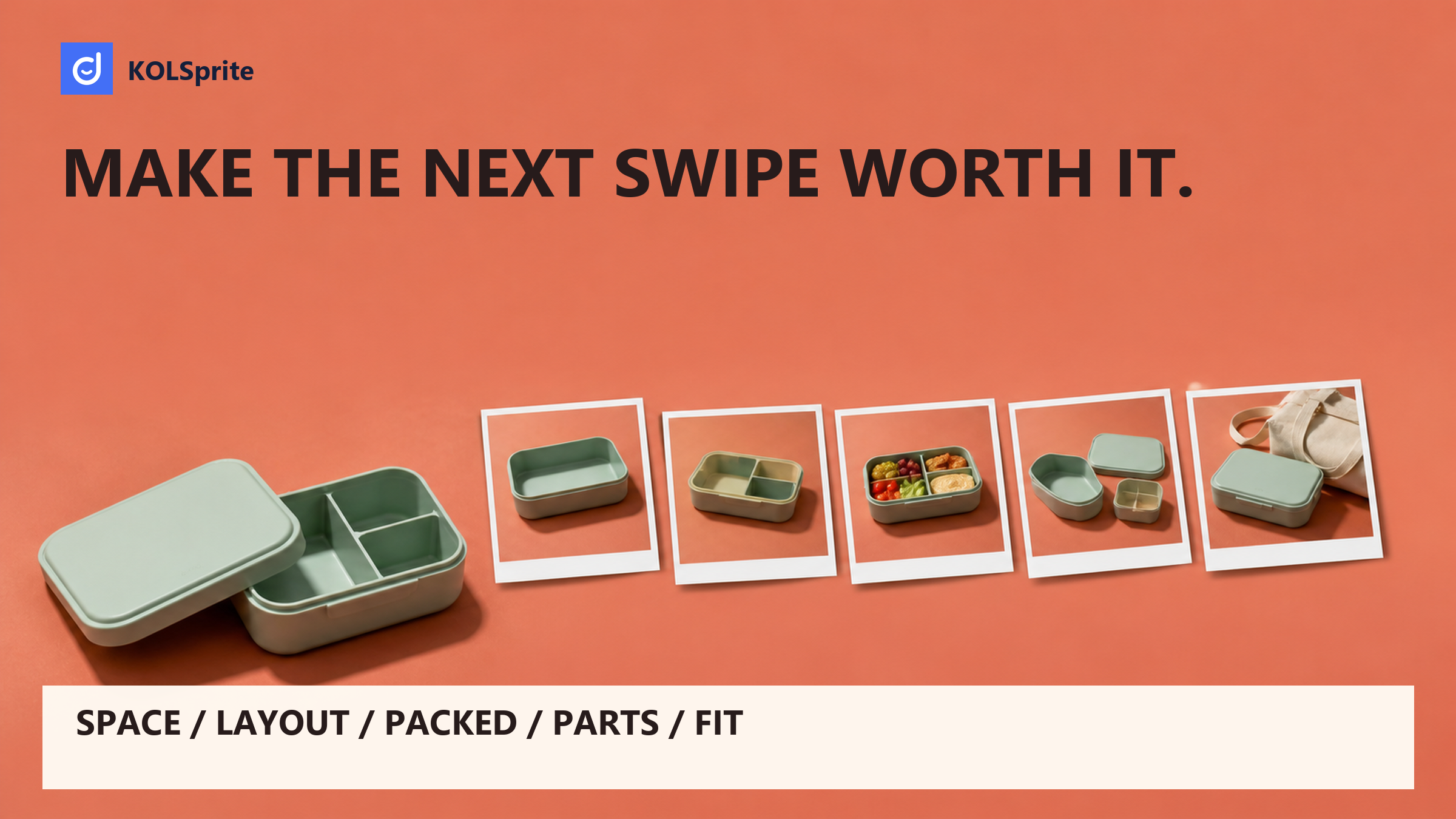
The rough path is simple: space, arrangement, packed view, separated pieces, then fit. Each turn changes what the viewer knows. That is different from open box, closed box, side view, another side view, and logo. The latter may help someone inspect a shape. It does not yet explain how the parts relate.
A still image is good at showing where things are in one visible state. It is less suited to proving how a material behaves over time. That distinction should set the boundaries of the copy. A packed lunchbox can show that the photographed food fits in that arrangement. It cannot prove that every lunch fits, that food stays fresh all day, or that the lid will never leak.
For this plan, the question is “How could I arrange the sections for this lunch?” It is not “Will this solve every lunch problem?” The first question gives the photographer a short shot list. The second would need evidence far beyond a few appealing images.
A frame also needs enough visual continuity for the viewer to compare it with the one before. Keep the box facing the same way when the arrangement changes. Keep the food consistent unless a change is part of the question. These are editorial choices, not platform rules. They help prevent the viewer from having to solve the image before understanding the product.
| Format question | Official source in scope | Original editorial decision |
|---|---|---|
| What is a paid carousel? | TikTok's paid Carousel Ads help describes ordered, swipeable images as an alternative to video. | An ordered format still needs a reason for each image. This lunchbox story answers one new question per frame. |
| Does that define an organic photo post? | The cited page covers a paid format, not an organic publishing workflow. | The five-frame organic plan below is a writing choice. It makes no claim about image limits, links, or paid-format support. |
| When would video fit better? | The paid-format description does not settle the evidence needs of this product story. | Use motion when the question concerns an action or a change through time, rather than a visible arrangement. |
Scope: paid-carousel format description compared with original organic story advice. Market: US-oriented ecommerce content. Access date: 2026-09-03. Sample: one official English help page, no posts or swipe data. Cleaning: paid details were not carried over as organic rules. Limit: organic availability and publishing controls were not verified; confirm them in the app before production.
The format decision belongs in the brief before the design work starts. A team that needs an organic story should not assume it can reuse a paid setup unchanged. A team that needs proof of movement should not force that proof into stills simply because a photo folder is ready.
Explore public buyer questions with a three-day KOLSprite web trial, then pair them with images you own. Publishing and ad setup stay in TikTok. MCP is separate.
Register and claim a three-day trial
Working premise: Show how the fictional lunchbox's removable sections divide one specific lunch. All copy below is original. Before shooting a real product, check that its actual parts support the shown layout. The plan does not claim leak resistance, freshness, capacity for every meal, or ease of washing.
Question: Where will this lunch go? Image: The open box and loose sections sit beside the sandwich, fruit, and snack. On-image text: “One lunch. A few ways to make room.” Reason to swipe: The viewer has seen the pieces but not the arrangement. The next frame must show a choice, not just another angle of the empty box.
Question: How do the sections divide the box? Image: Use the same overhead view with the sections placed inside and the food still outside. On-image text: “Start with the space your main dish needs.” Reason to swipe: The empty layout invites a check against the actual meal. Do not hide a gap with a label or change the size of the food between shots.
Question: What fits in this arrangement? Image: Put the same food into the sections, with all edges visible. On-image text: “Here is this lunch, packed.” Reason to swipe: The layout now makes sense, but the viewer may still wonder which pieces come out. This frame proves only the pictured fit. It does not establish that food will stay separate when carried.
Question: Which pieces can be removed? Image: Place the empty sections beside the base in a clear parts view. Keep every part used in the packed shot present. On-image text: “These are the parts of that setup.” Reason to swipe: The viewer can now inspect the system and may want to compare its shape with a lunch bag. Avoid soap or water props that imply a washing claim you have not checked.
Question: What should I check before choosing this box? Image: Show the closed box beside the actual bag used for the shoot, without hiding either edge. On-image text: “Check your bag against the box's listed dimensions.” Close: “This layout is one option. Your lunch and your bag decide the fit.” Use verified dimensions in the eventual product details, not invented numbers on the image.
Caption draft: “The layout starts with the meal, not with filling every section. This example puts the main dish first, then makes space for the fruit and snack. Check the actual box dimensions and care details before choosing your setup.” This closes the pictured story without introducing a new product promise.
Share a text outline of your photo sequence in Discord. Ask which swipe adds no new value before commissioning more images.
 +
+
Join the KOLSprite Discord community
The packed view is attractive because it resolves the layout question at a glance. It is also easy to overread. A person may see separate foods and assume they stay separate in a bag. The copy should not encourage that leap. A still shows a state, not what happens during a commute.
If staying put is the central buying question, the team needs a new brief and suitable evidence. A real demonstration could show the relevant movement, with its conditions clear. The five-frame plan should not be stretched to stand in for that work. It can remain a useful layout story while another asset answers a different question.
The TikTok video ideas guide can help connect a question with a proof format. A motion-dependent idea does not make the photo story bad. It tells the team where the story stops. Knowing that boundary is useful when a small asset budget must cover more than one buyer concern.
A different still-image question could change the order without needing a new format. If the main concern is the number of loose parts, open with the parts view. Then show how they form the packed setup. The same image folder would tell a different story because its first uncertainty has changed. That does not make one order a proven winner. It makes each order answerable to a distinct brief. A layout story and a parts story should not both start with a generic beauty shot.
An owned asset folder tells you what can be shown. Public category discussion can suggest what people want explained. KOLSprite's supported public comment analysis can help collect those questions. Read the original context before turning a comment theme into a brief. A sarcastic reply or a question about another model may not describe the problem your photos can answer.
The output should be a question-to-frame outline with original copy. It should not be a claim that a comment represents all buyers. In this fictional plan, a question about removable parts would support the parts view. A question about leaks would expose a gap. It would not give permission to call the box leakproof.
KOLSprite does not publish carousels, generate the ad format, certify image rights, or measure private swipe-through performance. The owned images still need a rights check, and any product claim still needs a factual basis. The TikTok creator brief template is a useful place to record the required shot and its claim limit.
This also changes how feedback is read. If a teammate cannot tell which parts move, the fix may be a clearer parts view. It is not evidence that an audience prefers a different carousel length. Keep local editorial feedback separate from measured audience behavior.
Put the five images in order and cover one at a time. Which removal leaves the story intact? In this plan, frame two is the first candidate. If the packed view makes the section layout clear on its own, the empty arrangement may add little. Losing it would leave the reader's main questions answered.
But if the food hides the edges between sections, frame two earns its place. That is a visual judgment, not a rule that five images are better than four. The order should serve the information, not a target length. A TikTok content strategy can set the role of the post; the images must still justify each swipe within it.
The closing bag image deserves the same scrutiny. Without a truthful scale or a useful fit question, it is only lifestyle scenery. Keep it only if it helps the viewer make the next decision. The dispensable frame is the one whose absence changes nothing the viewer can understand.
Latest Articles

As an essential, data-driven toolkit for TikTok influencers and marketers, KOLSprite provides powerful features for effortless creator discovery, trending content identification, and actionable real-time insights.
It empowers users to make smarter decisions and significantly boosts their TikTok business.

 Refer & Earn