 +
You have one product, a short shoot, and a long list of possible pictures. Which ones should you make? For an ecommerce seller, the best product photography ideas begin with the questions a shopper cannot answer by holding the item. Show what is included, what the product looks like up close, and how it fits into a real setting.
Start with a clear image of the item for sale. Then choose a few different views that answer specific questions, such as size, texture, setup, or use. Check each marketplace's rules before choosing a main image.
The examples below can help you make a small shot list. You do not need every technique in one gallery, and an attractive scene should never make a prop look like part of the purchase.
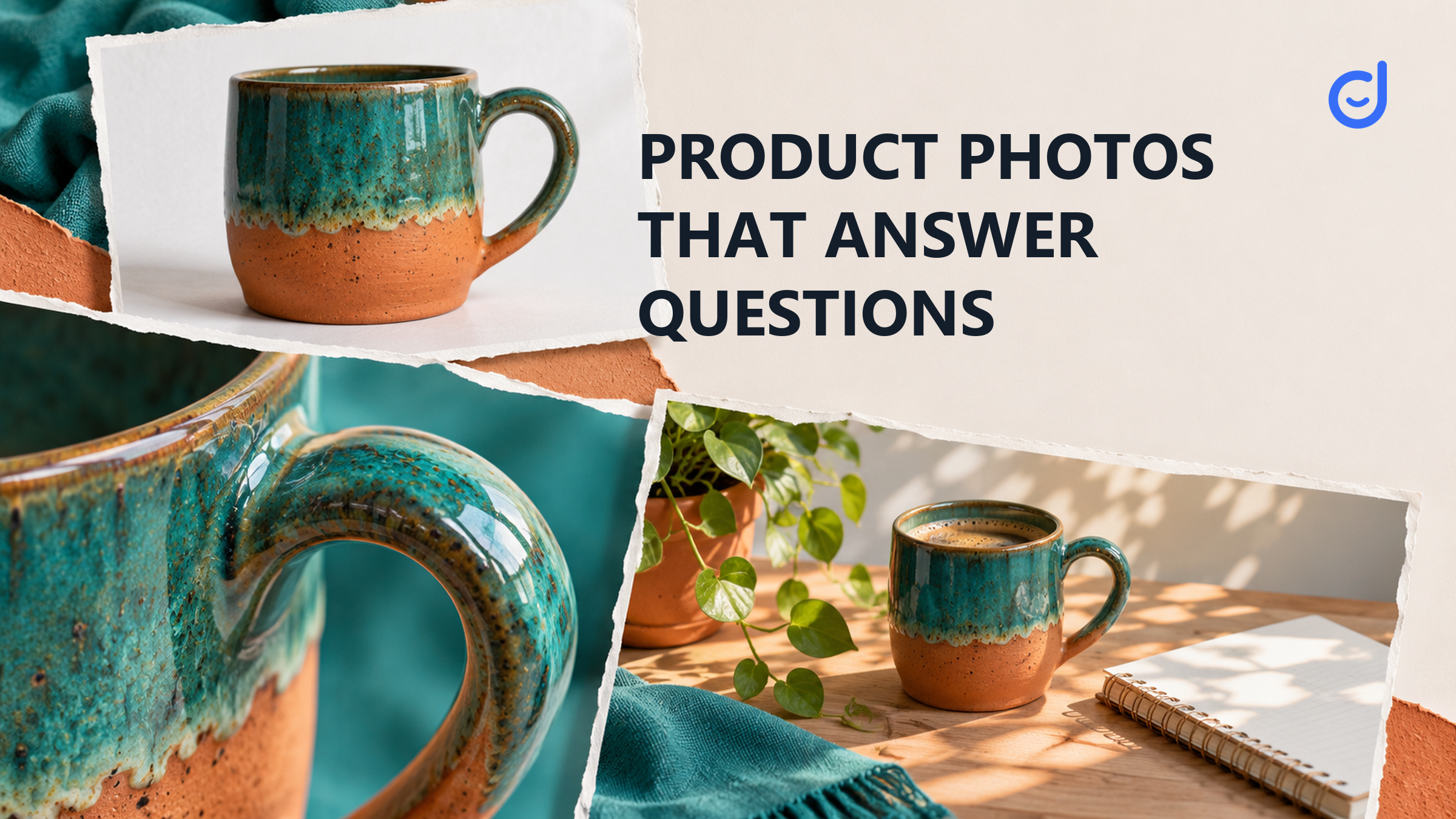
Imagine selling a ceramic mug. A shopper might want to know the mug's color, whether a lid is included, how large the handle is, and whether the mug fits beside a laptop. No single view answers all of those questions well. A clean front view helps identify the item. A close view shows the rim and glaze. A scene on a desk can suggest how the mug fits into a routine, though the listing should still provide actual dimensions.
This mug is a hypothetical example, not a product we photographed or tested. Its point is simple: make the next image add something a buyer could not see in the previous one. Five nearly identical angles are less useful than a few views with distinct jobs.
One sentence can give each image a job: “This shows the handle,” or “This shows the product beside an object for scale.” If the sentence is only “this looks nice,” the picture may still be useful in social content, but the listing also needs to answer practical questions.
The guide to listing and social photography explains how those two image jobs can share one shoot. Here, the focus is the individual views you might choose.
| Image idea | Question it can help answer | Check before using it |
|---|---|---|
| Clear front view | What is the item I am buying? | Use the correct variant and required background. |
| Detail close-up | What does this material or feature look like? | Make the detail representative of the actual item. |
| Scale in context | How large is it beside a familiar object? | State dimensions separately and identify props. |
| Product in use | What does the product do in an ordinary setting? | Show a real use without implying an unsupported result. |
| Included items together | What comes in the package? | Do not add a prop that looks like an included accessory. |
A clear view grounds the whole set. If the buyer is considering a bag, that may mean showing its actual shape and color. The detail view can then focus on a zipper, a seam, or a pocket. A scale view could place the bag beside a notebook, but it should not leave shoppers guessing whether the notebook is included.
For a food storage container, an in-use scene might show it on a shelf. A second view can show the lid and opening. If the product comes in several sizes, make clear which size is in each picture. A photo can show a useful relationship; it cannot reliably replace a written measurement.
For the next decision, allocate images across listing and social use
A photo idea is easier to judge when you can see how someone used it. Shogun's collection of product photography examples describes several approaches, including a backpack shown in a setting, product variations presented together, and a product shown from multiple angles. Open the source to inspect its examples and decide which approach would answer a question about your own item.
The collection is useful as inspiration, not as permission to reuse a brand's pictures. Check rights before copying or republishing an image. The source also does not establish that any one view increased sales. You can borrow the principle of showing scale or multiple angles without presenting another seller's result as your own.
For a simpler setup, Canva's beginner guide discusses space, lighting, composition, camera viewpoints and editing. Those are options to test with your own equipment. They do not mean that every product needs a studio, a special lens or a complex set.
A practical approach is to create one basic view first and check that it looks like the item customers will receive. Then make one deliberate change: move closer to show a detail, add a recognizable object for scale, or show the item in a normal use setting. Comparing the two images side by side makes it easier to see whether the second adds information or serves a different placement.
Not every image belongs in every position. A dramatic scene with props may be useful in an editorial or social context, while a marketplace's main image may have stricter rules. Do not assume an image that works in a creator post will automatically qualify as the first image on a product listing.
| Placement question | What TikTok Shop's US listing policy describes | Planning implication |
|---|---|---|
| What should the main view show? | A front physical view of the product on a pure white background. | Reserve a clean setup for the actual product and variant. |
| Can other images show more detail? | Additional images may show sides, details, use scenarios, close-ups and size comparisons, subject to the policy. | Plan extra views around the buyer's remaining questions. |
| Can a prop imply an extra item is included? | Images must accurately represent what the customer will receive. | Keep the offer clear and explain included items in the listing. |
Source: TikTok Shop's US Product Listing Policy, checked November 9, 2026. Review the current policy and any category-specific requirements before publishing.
Other marketplaces can have different standards, so the rules for the chosen placement matter. Keeping the clean original alongside styled versions also saves the team from trying to turn an elaborate scene into a compliant main image at the last minute.
A setting is helpful when it explains use. A towel beside a bathroom hook may show where the hook belongs. A hand holding a small kitchen tool may show scale and grip. A shelf scene may help a shopper imagine a container in a pantry. In each case, ask whether the product remains easy to identify and whether the setting creates an impression you can support.
A plant beside a bottle may suggest a natural mood, but it does not prove a product is natural or safe. A person smiling at a clean surface does not prove the product removed every stain. The image can show what is visible, while accurate product information explains the rest.
For a creator-led demonstration, include the image's purpose in the handoff. The creator brief template can help you state what must be shown without writing every frame for the creator. Confirm any permission and use terms before reusing someone else's content.
For the hypothetical mug, a first set could include a clean front view, a close-up of the rim and handle, a picture of everything included, and a desk scene for context. Add a separate dimensions graphic only where the destination permits it and the measurements are accurate. If the mug has a second color, make sure the image associated with that variant shows the right item.
After the shoot, review each image at the size at which a shopper will see it. Is the actual product clear? Is an important detail hidden by a hand or a prop? Does the picture add an answer that another view lacks? Remove a duplicate before adding another decorative setup.
If you are planning how those images connect to a wider selling route, the social commerce operating guide looks at the path from content to the product page. For this shoot, keep the goal narrower: a set of images that shows the item honestly and helps a shopper decide.
Latest Articles

As an essential, data-driven toolkit for TikTok influencers and marketers, KOLSprite provides powerful features for effortless creator discovery, trending content identification, and actionable real-time insights.
It empowers users to make smarter decisions and significantly boosts their TikTok business.

 Refer & Earn