 +
+
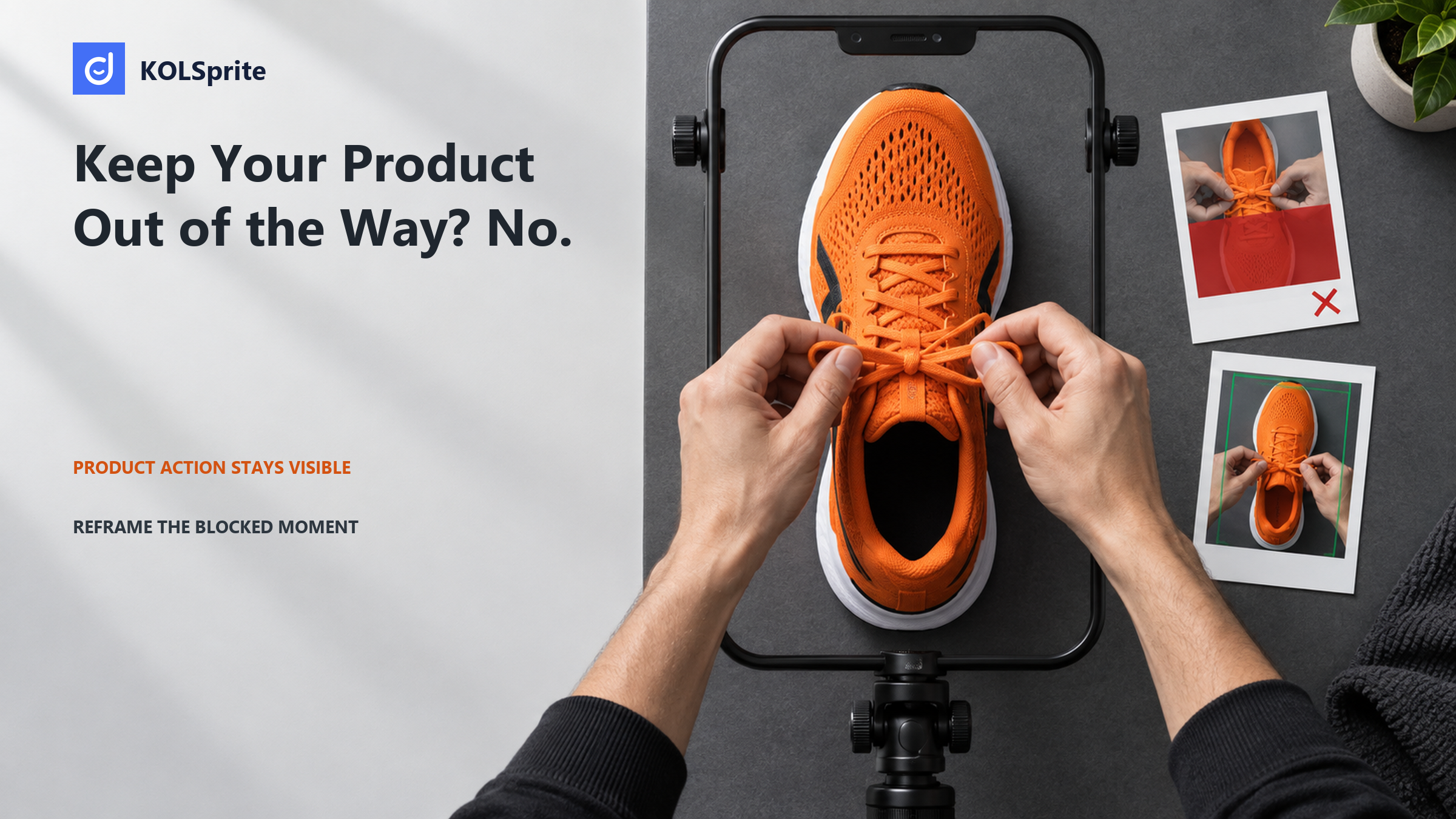
When a button covers the product, the design was usually judged as a clean canvas rather than a live ad. A paid-social designer should review the TikTok safe zone with the real caption, controls, and format in place. The aim is not to save every pixel. It is to keep the product action easy to see.
Direct answer: move or reshoot the blocked moment. Do not shrink every element. Protect the hand, tool, product surface, and result first. Then fit the text around that action. A placement-specific approval sheet shows what must stay clear and when a new shot is needed.
Design reviews often protect the headline while treating the product action as background. That is backwards for a demo. If a thumb covers the latch opening, the viewer loses the mechanism. If a caption sits over the before-and-after boundary, the viewer loses the comparison. If the call-to-action area covers the last movement, the promised result can look incomplete.
List the visual facts the viewer must see before you arrange text. These may include the point of contact, the direction of movement, a measurement mark, an indicator light, or the finished surface. Call this the action path. It is not a generic centered rectangle. It may travel from the lower left to the middle, or from a face to a product held near one side. The layout has to protect that path across time.
This is why “make everything smaller” is weak advice. Smaller type can become unreadable, and a smaller product can hide detail while still sitting under an interface element. A good revision changes position, timing, shot scale, or copy length according to what is blocked.
Draw the action path before you place the headline. Mark where the hand starts, where the product moves, and where the result appears. The TikTok safe zone must protect that route through time. A static box can miss a moving wrist or tool that enters the edge late in the shot.
| Observed specification | What it means for review | What it does not provide |
|---|---|---|
| Vertical 9:16 is recommended, at least 540 by 960 pixels. | Build and export for the vertical placement rather than adapting a horizontal master late. | A universal content-safe rectangle. |
| Safe zones vary with dimensions, caption length, and added formats. | Review the actual caption and format combination. | One overlay that is correct for every ad. |
| Preview can differ slightly from live display by device. | Leave practical breathing room around indispensable action. | Pixel-perfect certainty across devices. |
Source note: TikTok's auction in-feed ad specifications, dated June 2026 and checked September 14, 2026, say that dimensions, caption length, and added formats affect safe zones. Live display may vary slightly by device.
The practical conclusion is not to guess a single permanent boundary. It is to review the composition with the elements that will actually ship. A short caption and a long caption create different pressure. An added format can change the available area. The frame is a system, not a blank poster.
Inspect a comparable TikTok demo with KOLSprite and note the exact frame where controls compete with the product action. Use desktop Chrome. On a phone, open this article on your computer to install the extension.
First review the subject layer. Is the product large enough to inspect? Can the viewer see the contact point between hand and product? Does the camera angle reveal the motion instead of hiding it behind the creator's wrist? If the answer is no, graphic changes will not solve the shot.
Next review the message layer. Keep one primary on-screen statement at a time. Place it where it does not compete with the action path. Break a long sentence into timed phrases only when each phrase matches a new visual beat. Do not stack a headline, feature list, subtitle, and badge over a small product and call the remaining gap a safe zone.
Then review the interface layer. Add the working caption, account information, action controls, and any planned format treatment to the approval view. Scrub frame by frame through the demonstration. A still image can miss the exact moment a moving hand enters a crowded edge.
| Observed frame | Diagnosis | Better action | Approval note |
|---|---|---|---|
| A button area covers the final click on a small appliance. | The proof action occupies interface space. | Move the appliance and hand path upward in a new crop if detail remains clear. | Keep only if the click and indicator are both visible in placement. |
| A long caption covers the boundary of a cleaning comparison. | Message and result compete for the same lower area. | Shorten the caption or move the comparison higher; do not reduce the result until it cannot be judged. | Approve with the final caption, not placeholder copy. |
| The creator's wrist hides a fastening step near the right edge. | The camera angle, not the overlay, blocks the mechanism. | Reshoot from the opposite side or capture an insert close-up. | Do not solve by making the whole video smaller. |
Example note: the comparison was prepared September 14, 2026 to show how an art director might respond to common obstructions. Exact interface positions and live display require placement review.
The first fix is economical when the source image has enough resolution and the new crop preserves the movement. The second fix treats words as flexible and product evidence as scarce. The third accepts that no layout trick can reveal an action the camera never captured.
That distinction saves revision time. Cropping solves excess space. Repositioning solves a collision. Shorter copy solves message pressure. A reshoot solves missing visual information. Name the class of problem before asking a designer to move pixels.
Share the frame that worries you and pressure-test what must stay visible in the final placement.
 +
+
At the top of the sheet, name the placement, aspect ratio, final caption, and any added format. Then record the three or four protected visual facts. For a skincare pump demo, they might be nozzle, amount dispensed, application area, and finish. For a folding cart, they might be release tab, hinge path, locked position, and loaded result.
For each protected fact, mark the time range, screen region, and failure condition. A useful line reads: “Release tab, 00:05–00:07, center-right; fail if the hand or interface hides the press.” This is far more useful than “keep key content centered,” because it tells reviewers what key means.
Add a text check. Set the most lines that may appear at one time. Use the minimum readable size in your design system. Check contrast as the background moves. Also see whether subtitles and branded copy cover the same object. Then add a motion check. Watch for action that moves into interface space. Make sure the final result stays still long enough for a viewer to read and judge it.
Finally, give the reviewer three outcomes: approve, revise layout, or request another shot. A layout revision is appropriate when all needed detail exists. A new shot is appropriate when the source angle, scale, focus, or hand position prevents a fair view. This keeps the team from shrinking every asset to preserve a take that was never usable.
KOLSprite workflow: open a public TikTok demo whose action resembles the shot you need to protect. As you browse, note where the demo takes place. Track how the product moves and when each piece of text appears. Compare several ways to frame and place those parts. Then write an original brief for the designer. End with a specific creative decision based on your own placement review, such as “hold the product in the upper middle during the closing action.”
After the KOLSprite review, capture one still from the key action and mark the product, hand, and interface conflict. Give that annotated frame to the designer with the placement name.
A reference can reveal useful patterns: a creator may turn the package so a label faces the camera before the hand enters, or delay a text change until the action is complete. Those observations can improve your shot plan. They do not give you permanent safe-zone coordinates, and they do not replace a preview with your caption and format.
Limit: KOLSprite is a research aid, not an automatic safe-zone checker or editor. It cannot certify that a composition will remain clear on every device. The designer and media team still need to evaluate the intended placement.
Connect the framing decision to the wider job. Start with planning product ad creative, refine the message with the guide to writing product captions, and record the required action when agreeing a creator brief.
A clean canvas can give false confidence. The final ad has a caption, account context, controls, and a moving subject. Approve the assembled viewing condition. Watch the opening, the decisive action, and the result at normal speed. Then scrub the few frames where the hand, product, and interface come closest.
Ask four concrete questions. Is the product recognizable? Is the mechanism visible? Is the claim text readable without covering the evidence? Does the result remain clear when the final interface elements appear? Any “no” should lead to a named correction, not a blanket request to scale down.
End the review on the decisive frames, not on the tidy cover image. In the TikTok safe zone, the hand must complete its move and the result must stay open to view. Approve those moments. Move the words, change the crop, or call for a new shot when they fail.
Latest Articles
As an essential, data-driven toolkit for TikTok influencers and marketers, KOLSprite provides powerful features for effortless creator discovery, trending content identification, and actionable real-time insights.
It empowers users to make smarter decisions and significantly boosts their TikTok business.
 Refer & Earn